
Play with It – Belgrade
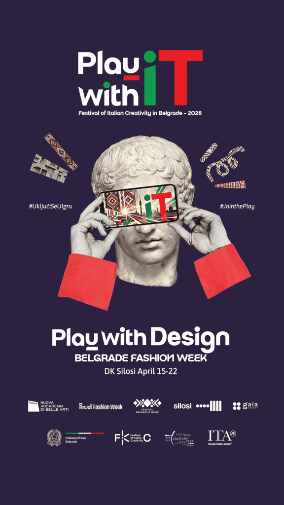
Orange Studio is pleased to participate in the promotion of the Play with It – Belgrade, Capital of Italian Creativity 2026 project, implemented by the Embassy of Italy in Belgrade.
The festival brings together Italian and Serbian institutions, companies, and creators through five programme areas focused on fostering creative dialogue in the fields of design, music, sports, technology, and gastronomy. The project aims to strengthen cultural and professional ties, as well as to promote contemporary creative practices.
Within the project, Orange Studio is responsible for the strategic development and implementation of the communication programme, visual identity development, media relations management, as well as video and photo production, and the development of the project’s overall digital presence.
ARA PLAZA RETAIL PARK
In the development of shopping centers, the name and visual identity represent a key tool for positioning.
We created the name and logo for the Ara Plaza retail park in Aranđelovac, with the aim of establishing a clear and modern identity that lays the foundation for a brand that is easily recognizable, functional, and sustainable in the long term.
Throughout the naming and visual identity design process, the focus was on:
– clarity of communication,
– applicability in a retail environment,
– connection with the local context and everyday consumer habits.
The result is an identity that supports the further development of the project and its visibility in the market.
UNICEF
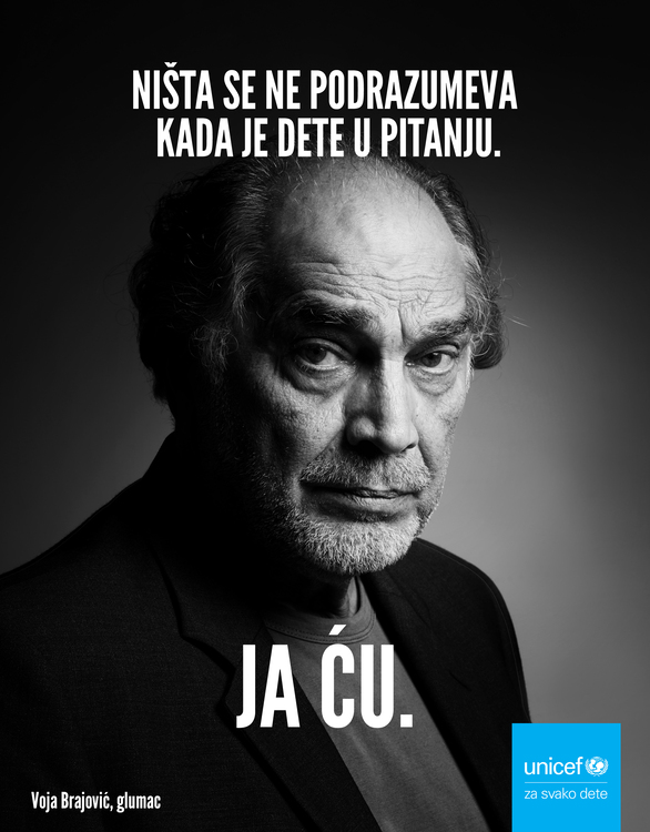
Orange Studio developed a creative solution for the “I AM” campaign, implemented in cooperation with UNICEF, with the aim of encouraging personal responsibility and active participation of individuals in creating a better environment for every child.
The campaign is based on a simple but powerful message – change begins with a personal decision. Through the message “I AM”, the focus is placed on the individual contribution and willingness of each of us to take a small but important step towards positive changes in society.
Through the visual identity and communication concept of the campaign, Orange Studio tried to present this idea clearly, directly and engagingly, so that the message would be recognizable and easily transmitted through different communication channels.
ORANGE STUDIO IS A SUPERBRAND 2024–2025!
It is with great pride and gratitude that we announce that Orange Studio is the winner of the prestigious Superbrands 2024-2025 award in the Marketing and PR agency category!
This title doesn’t just belong to us — it belongs to all the clients who had the courage to step outside the “safe zone”, to all the ideas that pushed the boundaries, and to every moment in which we chose substance over form.
We thank the Superbrands team for this recognition, which reminds us that courage and freedom in creativity is not only our philosophy — but a value recognized by others.
Thank you for believing in us.
Because bold is the new smart.
YOUR 5 MINUTES

With great enthusiasm, we created a 360° campaign for Tvojih Pet Minuta – Apricot Donut, blending creative design, illustrations, and packaging into a unique story that captures the rich flavor of this sweet treat.
Every aspect of the campaign was crafted with attention to detail—from the playful illustrations, which visually convey the freshness and warmth of apricot, to the packaging design, which highlights the product’s appeal and invites indulgence. This campaign encompassed all key elements, delivering a comprehensive communication strategy, seamlessly integrating digital and offline presentation.
And while working on creative solutions, inspiration inevitably had to be tested—through tasting! With a smile, we admit that donuts were not just the subject of our work but also a delightful addition to our creative process.
The result is a campaign that perfectly translates the flavor and energy of the brand, leaving a memorable visual identity that attracts attention and encourages enjoyment in every bite.
Balkan ekspres

For the premiere of the musical “Balkan Ekspres” at the Theater in Terazije, we had the opportunity to give our creative contribution to this great project!
We were in charge of the visual identity and all graphic solutions of promotional materials – from posters, through digital visuals, to all the details that accompanied this campaign.
Inspired by the legendary film classic and exciting story, our team wanted to capture the spirit of the era and adventure, but also to bring the freshness and energy of the musical.
Working on this project was a real creative ride – from the first sketches to the final design, every detail was carefully thought out to convey the atmosphere of the “Balkan Express” to the audience.
We are proud to be part of this theatrical spectacle and thank the Terazije Theater for the trust shown.
See you at the theater – the Balkan Express is on its way, and we are here to follow it visually every step of the way!
Analogna mala dela

In the era of digital communication and busy life, we often forget about the small moments that make life special. Through a series of visually striking outdoor solutions, we remind you of the value of human contact, patience and kindness.
We ask important questions about our everyday life:
Who did you smile at today?
Who did you listen carefully to yesterday?
How many times have you said “good morning” today?
When was the last time you were patient?
We invite all of us together to stop, look around and pay attention to the precious moments we share with the people around us. Because it is these small gestures – a smile, attention, closeness, kindness, patience – that build bridges between people.
Alma Quattro “Forgotten Primer”

At the end of the year, we created the “Forgotten Primer” campaign with great pleasure, which represents a significant CSR project that reminds us of the fundamental values of our society.
This initiative was created in cooperation with our long-time client Alma Quattro and our gallery O3ONE Art Space. Our aim was to emphasize the importance of returning to the essential principles that are crucial for the well-being of the community.
For us, “Forgotten Primer” is not only a marketing campaign, but also a call to social responsibility.
It reminds us all of the values to which we should return every day because they are still essential for our collective well-being.
In a time of rapid change and challenges, this campaign serves as a reminder of the foundations on which we build a better society.
Cover page of the book “Under someone else’s sun”

We had the honor of collaborating with Miodrag Miša Majić on designing the cover of his new book “Under someone else’s sun*”. This book, published by Vulkan publishing house, brings a deep story about human suffering and hope, which we tried to convey through the visual identity of the cover.
Our inspiration for the design came from the very essence of the story, which takes place in the uncertain waters of life. Through a minimalist approach and symbolism, our goal was to convey to the readers the atmosphere and emotions that the book carries.
We thank Miodrag Majić and Vulkan for the trust and the opportunity to be part of this creative process. We look forward to further cooperation and new challenges!
MASKKING

Maskking, the world-famous brand of electronic cigarettes, has become our new client. For Maskking, we created a comprehensive 360° marketing campaign focused on their new peach and grape flavor.
Maskking, founded in 2015, is known for its compact and easy-to-use vaping devices that have won the hearts of tens of thousands of users around the world.
Our campaign is designed to highlight the innovation and quality of Maskking products, especially their new refreshing taste that combines juicy peach and sweet grapes.
Through this 360° campaign, we used various marketing channels to effectively promote the new Maskking taste and further strengthen the brand’s position on the electronic cigarette market.
Ben Akiba

Laughter is a universal language that erases all borders, and at this festival there is never too much of it – just like Ben Akiba’s mustache is never enough for all lovers of good comedy. The campaign we did for this festival is characterized by a minimalistic and retro approach to design. For the key symbol, we created a stylized mustache that serves as a recognizable symbol of comedy and a link to the name of the festival. We created this campaign with joy and enthusiasm, inspired by the ten-year tradition of laughter and positive energy of the Ben Akiba Club, translating that spirit into a visual identity that exudes cheerfulness.
BEOGRADSKI SINDIKAT

We received enormous respect for the opportunity to create a total look campaign for our iconic hip hop band Beogradski sindikat on the occasion of their 25th anniversary. Sindikat often points to various problems in our society. They are profiled as a very engaged group, with sharp political views and a strong patriotic note in their songs. This made the challenge bigger for us and we are very proud to have made our creative contribution to this important project.
RED BULL HALF COURT

The Red Bull Half Court World Grand Final took place at Kalemegdan in Belgrade, Serbia – a country with a rich basketball culture, a country that has produced many legendary aces. National winners from five continents and from 25 countries gathered in September 2023 at the World Finals, where they competed for the world king of “street” games 3×3! We had a great creative challenge to be part of the team responsible for the total visual identity and complete branding of this spectacular event.
RILASTIL

We have developed a complex web site for a top dermatological cosmetic house that includes several special lines of skin care for the face and body. The basic value and historical factor underlying Rilastil’s guidelines is quality, which is guaranteed by the effort in creating and formulating scientific laboratories and continuous research. Carefully selected active ingredients ensure the best quality, the greatest cosmetic comfort and high performance. Innovative active ingredients, specific formulas, the use of packaging materials designed to preserve the integrity of the formulas in the best way, clinical tests and high-quality processing – guarantee the effectiveness of Rilastil products.
ŽC MILICA & NOVARTIS

Why me? – a question that each of us asks so many times in our lives. But the only women who beat breast cancer proved and showed by their example that – Life is a miracle worth fighting for! Their authentic personal confessions aim to empower all women that breast cancer is beatable if diagnosed in time. For the Milica Women’s Center and Novartis, we had the opportunity to create a new integrated campaign “I’m stronger than (dark) cancer”, which consisted of television spots, billboards, a campaign on social networks, testimonials. A campaign that touched us all emotionally and was worth creatively fighting for.
INSIGNITUS GOLD

We have entered the golden age 🙂
Insignitus is a company that belongs to the ranks of the most serious business partners and dealers in investment gold and precious metals, and as such sets high standards in this business segment and becomes a synonym for expertise, professionalism, reliability and trust.
The offer includes the famous Osmium, the rarest precious metal and the rarest non-radioactive element of all elements. It is available as jewelry or as an investment metal.
The communication we created is based on the concept of the Art of investing.
FINSPOT

The beginning of the year brought us great pleasure to work with a team of excellent software engineers,
young people who created the first Serbian digital token and launched a digital investment platform on the market
approved by the Ministry of Finance and approved by the European Bank for Reconstruction and Development.
The promotional campaign called “Tokenization” successfully supported their business activities, presenting them to the public through adequate media,
and a good choice of communication channels and tools allowed them further success in business.
NATIONAL THEATRE

Is there anything more exciting and creative than taking over the complete art direction of the calendar of 2023. for the ballet ensemble of the National Theatre.
Another wonderful work of our Nebojša Babić.
A huge honor, pleasure, but also a responsibility.
Let’s meet the New Year with ease of movement, the beauty of rapture and the touch of the boards that mean life.
A huge thank to the National Theater and the complete ballet ensemble, who were ready to step out of their comfort zone and conjure up a completely new world for us.
VEKOL DMC

The end of the year is a big finish for all of us, which we often end by creating calendars for the following year.
This time everything came together in one: dear friends as clients, a fun atmosphere at the photo shoot as a kind of teambuilding for the most important hotels in the city and finally, a refined minimalist design.
Our Vekol DMC is more than a client, they are not just business partners but friends for life.
And that’s why in New Year 2023, you can expect many new creative joint projects from us together.
Let’s toast to the new challenge ahead of us together!
BELGRADE FASHION WEEK

The Belgrade Fashion Week is the first project of its kind in Eastern and Southeastern Europe, and has been organized twice a year for twenty-five years. Given that it gathers the most important Serbian designers and fashion companies, renowned foreign brands on the domestic market, talented young designers, fashion design students, interesting international fashion creators, as well as numerous domestic and foreign media, it is considered one of the leading fashion events in the region.
The jubilee 50th Loreal Fashion Week lasted a whole month this year, and we had the pleasure of taking care of the visual identity of the entire manifestation and all accompanying programs. We were part of a complex organization and were involved in certain aspects of the program, such as the exhibition of fashion photographs by Aleksandar Kujučev, Miša Obradović and our own Nebojša Babić, organized in the Staff Gallery.
Beauty and creativity in one breath!
RAMBO AMADEUS
What a roller coaster exchange of energy, ideas and lucidity this was.
Our Nebojša Babić is the director and director of photography for Rambo’s new video “Pod rotacijom“.
When two geniuses come together, entertainment is guaranteed.
And we as Oranges crew were LOL. 🙂
VICTUS PROTEIN BAR

Brand new Victus brand superpower protein bars that are about to take the market by storm.
We had the honor of participating in the complete process of creating this brand, from the very idea to the realization of the total brand identity and communication.
We are pleased to present the next level of Victus bars with no added sugar.
Healthy, strong and delicious.
BAKE O´CLOCK

Fantastic four has arrived!
Forget about long meal preparations and mess in the kitchen – Bake o´Clock has arrived.
We offer four mixtures for fast and healthy meals, which require 5 to 30 minutes of preparation.
We are proud to present kitchen superheroes from our creative Orange kitchen.
In the process of creating the brand, from its total identity to communication, we enjoyed the work but also the delicious snacks.
We enjoyed the cooperation of all the senses.
STAMEVSKI

All our celebrations are sweeter with Stamevski cakes and cookies!
We have the opportunity to be part of a leading company in confectionery, to continue to grow and create sweet and irresistible pleasures together with Stamevski family and a tradition of more than 65 years.
The values that are synonymous with this traditional brand, in addition to loyalty to the highest quality ingredients and handmade, are dedication and love, where we also recognize ourselves.
We actively participate in all processes of marketing performances of a brand that conquers new markets in the region and Europe.
We are proud to be part of the sweet Stamevski story.
PLAN B FOUNDATION

The goal of the Plan B Foundation, which has become our business partner and with which we share common interests, is to improve the quality of life of musicians and the well-being of society. Our guiding idea is to use our marketing knowledge and skills to affirm Plan B and motivate as many people as possible, whether individuals or companies, to join the foundation and help support artists who have found themselves in difficult life situations. Join us and donate to planbdonate.com because TOGETHER we can do much more!
YUGOSLAV DRAMA THEATER
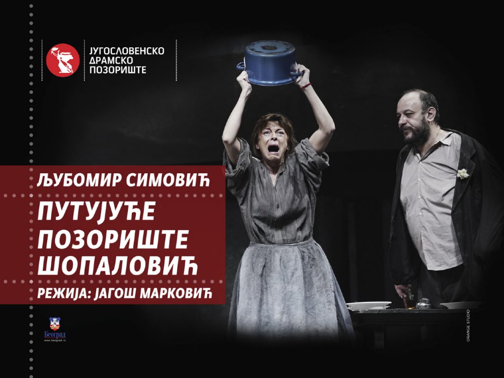
We have been enjoying creating promotional materials for the performances of this theater with immense pleasure and honor for two years now.
The Yugoslav Drama Theater has existed since 1947 as a representative theater of a supranational character, and our responsibility is even greater.
Classics in a new way, domestic and foreign, contemporary turning points, and always in the first place domestic texts are the pillars on which, in accordance with their own tradition, rests a tall building of spirit, style and taste called JDP.
We attend the process of creating plays from the very beginning, through rehearsals, until the premiere. We capture every moment through photos that we use as a basic visual tool for billboards and all the accompanying programs.
E-commerce association of Serbia

The goal of the first HotSpotAwards in which we actively participated was to map the market and raise the standards of the e-commerce industry in Serbia, in order to assimilate into global e-commerce flows.
The E-commerce Association of Serbia organized the award ceremony for the most successful companies in the field of electronic commerce in the region.
Within the three categories, 21 awards were given to the most successful companies in various fields, and the Champion award went to Wolt company.
Our expert Web team continues this year traditionally with the promotion of online shopping in Serbia, which is significantly improving every day.
Red Cross of Serbia

In cooperation with the Olympic Committee of Serbia and the Ministry of Health, for the Serbian Red Cross, we created a campaign called “Life in your hands”.
The campaign aims to educate citizens on how to react in moments of sudden cardiac arrest, because when the heart stops, the first minutes are precious and save lives. By carrying out resuscitation measures, we are “buying precious time” until the arrival of the medical service, because just waiting for an ambulance and a doctor without adequate help can lead to a fatal outcome.
The promoters of the campaign are our prominent athletes with whom we worked on photo and video recording for the needs of the campaign.
HOTEL GRAND KOPAONIK
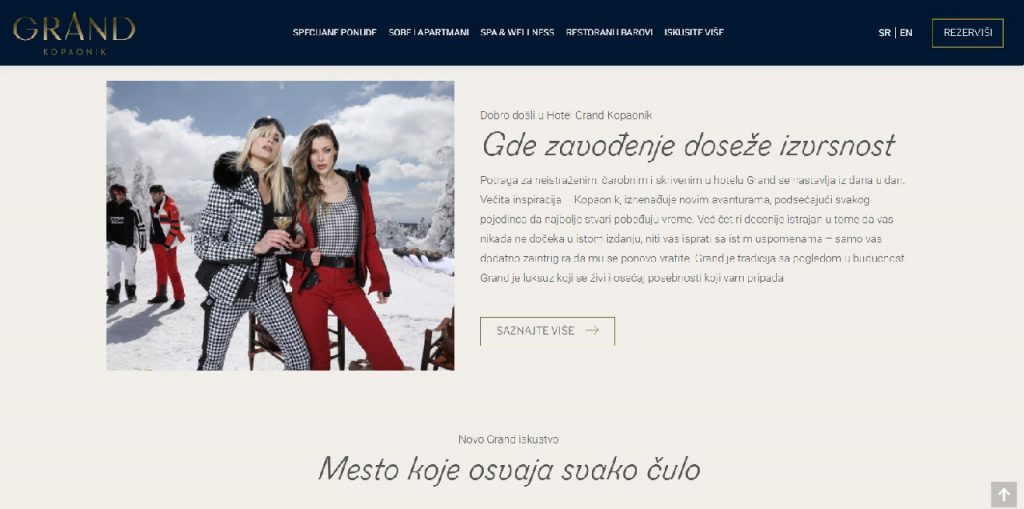
The start of the winter season for us was very inspiring and challenging because we found ourselves in the company of the best. According to the art direction of our dear friends and partners Coba & Associates, we worked on the development of a new website for MK Resort and their luxury hotel “Grand Kopaonik”, which was completely renovated and redesigned on the occasion of 40 years of existence. Tradition has been innovated, a new brand GRAND has been designed. Our digital team was in charge of complex website programming, SEO optimization for search engine positioning, refreshing the booking system, technical support as well as regular content updates.
Vinarija Kozlović

To make a toast to the beginning of the New Year 2022 with the desire to clear our minds and enjoy all our senses. Our new partner for this year, Kozlović Winery, will greatly contribute to that.
Kozlović is a winery, wine, product, brand, experience, family name, and all that represents quality, a set of values and professionalism, a combination of tradition and innovation, experience and emotion.
Orange will bring you the magical spirit of Istria because we are in charge of the strategic positioning of this famous Croatian brand in our market, its appearance on social networks and Google advertising.
You can order wines via the mobile app www.winedropclub.com
SREDNJA ZEMLJA

For the end of the year from us: a combination of beautiful and useful. For our good friend and excellent artist Zoran Velimanović, we designed and completely edited his first retrospective book called “Objects”, which is accompanied by a billboard campaign announcing the promotion.
The work on this project was marked by a great atmosphere with great enthusiasm and creative energy.
LULU

A real sweet refreshment comes to us from our Lulu Bakeries. Fruity, chocolate, crunchy, creamy and lavish sweets bring a smile to your face.
Words are superfluous to describe the magic that every Lulu product hides in itself. We enjoyed all the senses in creating a new campaign, and the members of our creative team literally enjoyed it.
We ate everything 🙂
Don Don

For our long-time client Don Don and their brand Your 5 Minutes, we have created an integrated campaign (ATL, BTL, Digital) for the new product Burgers and Hot Dog.
With high quality soft buns it is easy to make your favorite burger. Now you have a great reason to spend time with friends or your family. Enjoy the company and good tastes.
Lalošević
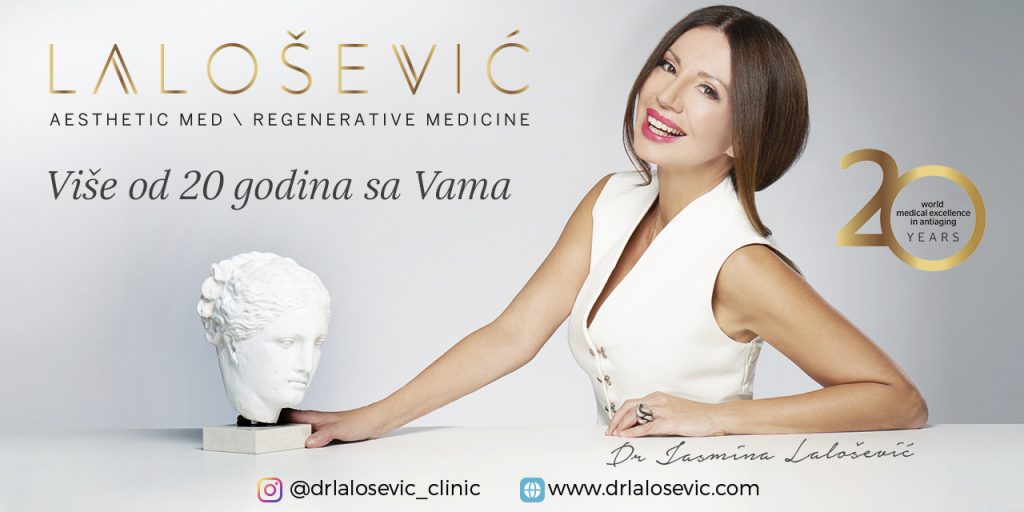
As a result of 20 years of work in the field of anti-aging, Dr. Jasmina Lalošević, the specialist medical practice Regenerative Medicine Dr. Lalošević, aesthetic center Aestheticmed Lalošević and Aestheticmed d.o.o. registered representative of the renowned French laboratory REVITACARE for mesotherapy cocktails and regenerative hyaluronic fillers REVITAFILL Xtra. This year’s campaign, which we created, aimed to mark the anniversary of the successful operation of the aesthetic center.
AcademIAA

AcademIAA is an educational program led by true leaders from the world of marketing and business. It is intended for students, young “marketers”, but also entrepreneurs with up to five years of experience in the profession. There are six different modules: business, creative, media, digital, innovation, research and analytics. Our creative team was given the opportunity to create a visual identity as well as a complete campaign.
Sokoj

The great pleasure of the whole team at Orange studio was the work on the project of the conceptual design, layout and printing of the Monograph created for the celebration of the 70th anniversary of SOKOJ.
This Monograph follows the transformation of this institution from its foundation in 1950 as the Union of Composers of Yugoslavia, to today’s Serbian Music Authors’ Organisation and sheds the light on a cultural milieu in which it existed and survived until today.
ZEPTER
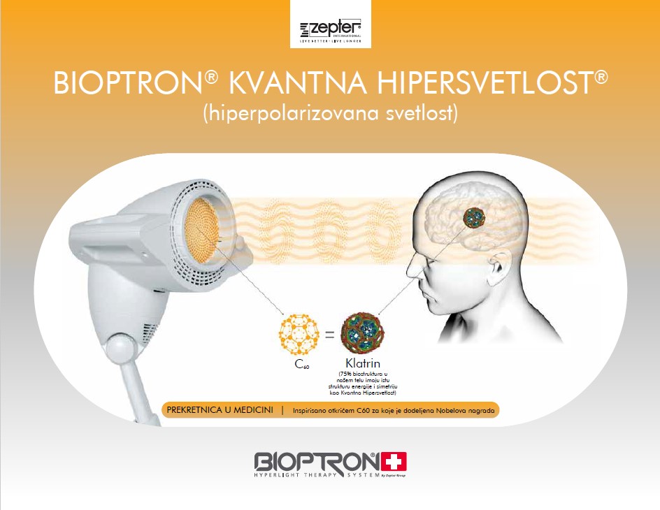
We have increased our Orange happy family by another important member.
Welcome to Zepter International.
Our creative team is in charge of the conceptual concept, graphic design
and promotion of products such as Bioptron, Hyperlight Eyewear, TAS 100
– Therapy Air Smart, as well as the Luxory Overdose perfume line.
It is a pleasure to be a part of the Zepter world.
IDEA

IDEA Residence is a modern and different shopping experience, with numerous novelties in the offer of premium products.
It is a high class, luxuriously equipped retail facility, which fits perfectly into the residential architecture of the complex “Kneza Miloša Residence”.
The Orange team created the total identity of the retail, interior design, scenographic elements, interior and exterior signaging.
BELGRADE CITY MUSEUM
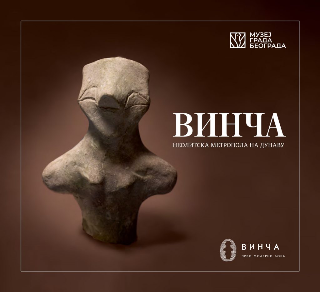
Orange Studio continues the tradition of supporting cultural institutions. We have achieved cooperation with the Museum of the City of Belgrade through two important projects.
We organized the exhibition “Vinča – Neolithic metropolis on the Danube” and realized a complete promotional material in the form of brochure, invitation, poster.
For the project “Four Gospels – the first book printed in Belgrade”, we created a multimedia interactive presentation and were in charge of the graphic design of communication tools.
We are looking forward to new projects that we are preparing for this year.
LULU

LULU bakeries, with its presence at approximately 10 locations in Belgrade, raise the level, both in the bakery industry and in monitoring the quality and opinions of satisfied consumers. Accordingly, the Orange agency and operational team who are working on this inspiring client have recognized the basic directions in color, the solution on branding interiors, exteriors, POS materials, etc., as well as the need to introduce a platform #novekomsije that contains everything we wanted our client to be recognized with in the local market.
Teledirekt

One of the leading telecommunications companies, Teledirek, has given us the “wind in the back”, to improve many of their services, together to make a breakthrough in the IT world. This is how the new concept of communication was created, the brand platform “It cant be more direct“, the new website and the visual identity. Together we look forward to the challenges that lie ahead.
RED BULL

In the athletics hall, we organized a long jump competition for 10 girls and 10 boys, chosen by Ivana Španović and Strahinja Jovancević as part of the third season of the #ttrenirajsaivanom action called “Skip your limits”.
We were, as always, in charge of the complete visual identity of the event and the promotional campaign.
After warming up, jumping test exercises, all competitors were given the opportunity to see how important jumping techniques are in order to achieve the best possible distance.
Galenika

In cooperation with the Chapter4 agency, we had the opportunity to participate in the creation and implementation of the latest campaign for Galenika’s brand Panthenol. Our task was to photograph Maria Kilibarda, who is the brand ambasador of the brand, as well as the graphic design of the main visual.
BIG SHOPPING SHOPPING CENTERS

Recognizable content, BIG discounts, concerts, festivals, favorite brands, have made these places one of the favorite gathering places for customers and visitors to the centers. The work of our team as always had “full” hands of creative work, creating a visual identity, branding the center , tactical activations and campaigns.
MAGNA PHARMACIA

Another in a series of successful and creative collaborations is the work on improving the on line business with the company Magna Pharmacia. Great ideas, people, energy have made the Magna site ever better, more innovative.
The great atmosphere at the photo shooting contributed to the whole team being brilliantly presented, all in line with the energy and work they lead.
Magna Pharmacia improves peoples health by offering the most modern medical means.
We continue to cooperate in the spirit of innovation with the aim of being together as successful and better as possible in all future business challenges.
UNICEF

As always, UNICEF was there with every child, trying to facilitate the situations in which we have been found in. During the pandemic of the Covid 19 virus, which stopped the whole world for a moment and kept every family at home, we created a campaign for UNICEF on social networks under the slogan: “For every child”, which beautiful stories, games, illustrations and interesting suggestions showed how we can spend time with our loved ones and at the same time remind us how much we missed that. The goal of the campaign is to keep the children’s smile, as the most important, and to provide every child much more safeness, love and attention.
BIG Fashion Park

BIG Fashion Park was opened in the same year as BIG Pancevo. Orange studio was hired to create a visual identity. Great attendance and satisfaction among visitors was increased by the opening of the long-awaited first Decathlon in Serbia. Outlets and brands to the taste of each consumer, a place for entertainment, are there to attract old and new customers every day with their products in the designed interior and exterior of BIG Shopping Park.
UDUS

The task was to present to the general public the rich heritage of the Association of Dramatic Artists of Serbia, which this marks the 100th anniversary and history of Serbian theater life, in general, and all – in just one campaign.
With the help of the Alma Quattro Company, which is always open to non-profit projects of general interest, we have created and implemented an OUTDOOR EXHIBITION, featuring important events in the history of our theater, great artists and great achievements, in advertising venues throughout the city. We hope that this solution is worthy of the anniversary that UDUS is celebrating and we wish this association to remain one of the pillars of Serbian culture in the future.
RTS – MUSIC PRODUCTION

It`s a great privilege and honor for our professional and creative team to work with an institution of national importance, which belongs to everyone. On whose side is tradition, persistence, heritage and elitism. With promotional instruments and creativity we wanted and we are continuing in direction of refreshing, modernity, but maintaining the brand recognition. Beside concert promotions, brand empowerment, promotion of musical virtuosos and esembles, we jointly supported various guest appearances, music festivals, donor events and auditions. And in the fothcoming period we`ll continue to carefully cherish good vibes as a pledge for a better future.
Alpina Drink

Alpina drink is a non-alcoholic refreshing sparkling beverage made of alpine plants, familiar to the older generations. The task was to create a complete campaign for this brand, not by reminiscing the good old days, but making this drink closer to the new generations. And that is how the famous blue rabbit was born, at first sight an illogical trademark of a beverage which represents the synonym of freshness. By creating the absurd Instagram videos with a rabbit wondering through the city and getting into all kind of funny situations, we have caused our social media traffic to go viral. Brand that was basically without an adequate advertising, was now getting over tens of thousands views on IG stories, and the blue rabbit dominated promotions at the swimming pools throughout Serbia and achieved its basic purpose – to draw attention. Now that we succeeded in doing so, together with our client, we are preparing new surprises. The best is yet to come!
Alma Quattro
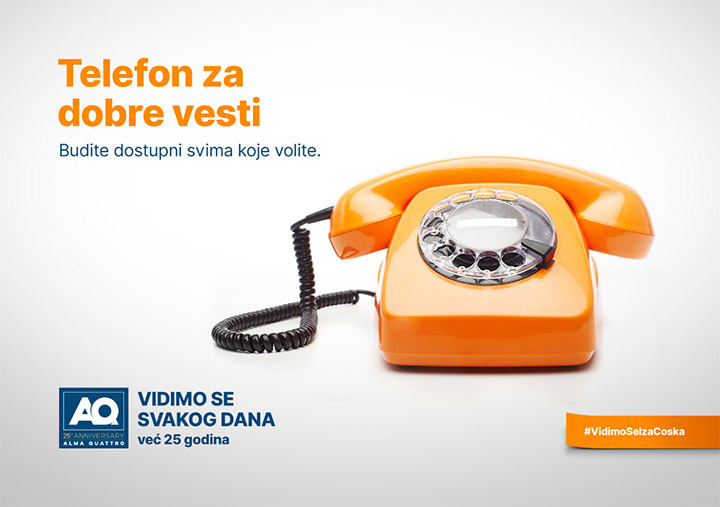
How to advertise someone who has been constantly around in our city, wherever we turn, mostly without being aware of its presence, because the purpose of its existence is to advertise the others? The company Alma Quatro, a leader in outdoor advertising, has summoned us to conceptualise the way of marking its 25th anniversary. The result of our cooperation is a campaign that filled us all with positive energy – a campaign of advertising the non-existing products that make our life nicer and more fulfilling. With a slogan WE HAVE BEEN SEEING ONE ANOTHER EVERYDAY, Alma Quatro really sent the right message about itself and presented itself as a company that is some kind of a ”good spirit” of the city and country where operates.
NECTAR – LIFE 100%

Working on the brand of juices Life 100% implies a constant struggle in order to explain to the customers, in an era with so many brands of juices existing on the market, and all of them claiming to be healthy and of high-quality, that the Life 100% is really the highest quality and the best juice. From the packaging redesign, through the TV campaigns that we developed, communication on social media, to the promotions and BTL activities, we had all the time on our mind that we need to transfer the message that we created, which best describes the Life 100% brand, and that is: THERE’S ONLY ONE LIFE!
MAGIC OLD MAN

As part of a wider campaign “Don’t believe in horoscopes. Believe in artists.” Orange Studio takes out the works of best local artist from the gallery spaces and makes them available to the wide audience. That is how the works of Magic Old Man from Rio (Dragan Radović), containing his wise thoughts and proverbs that make us think about life, appeared on billboards throughout the city. In a space that usually does not belong to them, these messages gained a completely new life, and we got a campaign that everyone were talking about!
NECTAR KIDS 100%
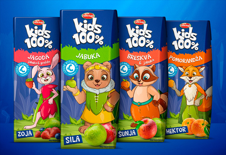
When the situation is complicated, sometimes is just best to – sing. This is why we created a nursery rhyme for our client Nectar Kids 100% about characters from the Nektarija wood and so successfully realised a complicated transition for the client after the Angry Birds franchise contract expiration. We redesigned the packaging of juices for kids, created characters for everyone’s taste and conceived around them a complete universe that lives on TV commercials, YouTube channel, radio… Our campaign for Nectar Kids 100% turned into a 100% success. In a short time the kids started to love the new characters and tastes and began to enjoy a mutual story that we created.
Norbs

The most beautiful thing is when advertising works for a common good! NORBS (National Organisation for Rear Diseases of Serbia) has established a foundation where money is being raised to help the people who are suffering from rear diseases. Being aware that we are operating on a sensitive ground, we created a campaign that is not pathetic, but based on something that these people are constantly dealing with – the problems and troubles they have in everyday life are simply – not visible enough. On TV, billboards, city lights and social media a very important message appeared that should make us wonder and inspire us to act: IT IS TIME TO NOTICE THEM!
DON DON
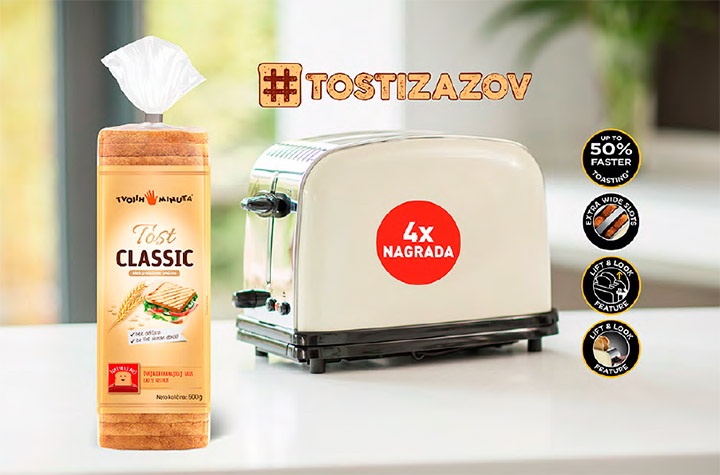
Don Don is a domestic company involved in the production and sale of bread and flour products. Their toast is truly high-quality, and its marketing presented a great challenge to us. That is why, among all the other activities on brand launching (packaging, ATL, BTL, digital), we organized a contest named TOAST CHALLENGE, aimed at motivating the customers to actively involve in the life of our toast breads on social media and to win the valuable prizes.
NECTAR LIFE

One of the numerous campaigns that we realised for our client Nectar Life, was also the Occasion campaign, whereby we communicated all the occasions appropriate to drink a juice. Besides it was fun to work on a task like this and notwithstanding the creativity that our designers had to demonstrate in the process, we cannot forget to mention a reward that came eventually. Orange Studio won the bronze award of the Serbian Society for Marketing Communications (UEPS) in the OOH category.
NIS

Orange Studio is responsible for digital activities of NIS Company. Apart from the everyday announcements on social media, digital activations and regular social media maintenance, we are particularly proud on the achievements made within the NIS MULTICULTURALISM project. The NIS Company emphasises its employees, coming from all around the world, as one of its most valuable assets, and our corporate movies that promote exactly the values of multiculturalism showed that in the best way.
BIG Fashion

No need to change a winning team. For several years now, we are responsible for the ATL communication of BIG shopping centers in Belgrade, Novi Sad and Pančevo. When you spot the recognisable billboards of these shopping centers in the city, containing the witty messages that invite people to shop with big discounts, you should know that these were conceived in our office. With our help, BIG has become a synonym for good shopping and fun!
EPOHA

Epoha distillery deals with the production of high quality fruit brandies, with fruits coming from the mountain Majevica slopes, by the traditional formula that has been used for centuries, which combined with the climate and soil provides these brandies with the characteristic flavors rich in their taste. In order to make these products available to the entire world, it was necessary to create names and packaging which depict the real character of these brandies. This is how Klasika, Romantika, Impresija, Simbolika were born…
NELT

We have realised a campaign for the Nelt products consisted of different stages. Upon completing the packaging design, the market saw a teaser campaign with riddles concerning the colors (It is little and white, for soul and body? What is it?). In the reveal stage we presented the products, later being advertised in ATL, BTL and digital channels. Integrated campaign encompassed as well the action of planting trees in schools #zdravosepokreni (get moving- get healthy) that had more than 250 reactions only after two days on social media.
Ilija Kolarac Endowment

We most look forward to when we can provide support to the outstanding art. Not only that we created the website for Kolarac, but we also participated in raising the funds for buying a new piano. In the period between 2014 and 2017 we organised an auction named The Concert for Piano, where we were collecting donations, organising concerts, giving the appreciation awards to donors… The result of all above-mentioned is that we can now all enjoy the play of piano virtuosos!
Delhaize

Delhaize Srbija is a member of the international trade chain Ahold Delhaize, the world’s leading retail chain with 6.500 stores throughout the world and with 370.000 associates. In Serbia, this company has been constantly working on expanding its product range, by continuously improving the quality, design and recipes. Speaking of design, Orange Studio realised the brand identity for Delhaize as well as the packaging for more than 250 products from the categories of food products, pet products, household chemical products and hygiene products.
MIONI – BLACK / YELLOW JUICE

The unforgettable campaigns sometimes occur spontaneously! We launched Black and Yellow Juice that immediately gathered sympathies and generated a buzz throughout the city as well as on social media. The project included a bottle and label design, as well as the product naming. To confirm that the Black and Yellow was heading to the right direction, we realised digital activities that consisted of posts where many of them instantly became viral and made people laugh.
RNB – GALAX

Oil Refinery Belgrade is well known for its GALAX engine oils and lubricants. This product had its ups and downs, and our task was to make sure that only ups remain. As part of the packaging redesign, we created a new visual identity for the entire product line. Our campaign also contributed to the efforts of making sure this brand achieves only successes by launching the new positioning statement– UNSTOPPABLE! After this, the brand really became unstoppable on the market.
MOL Serbia

MOL Serbia is recognized in the market for high quality products. Our task was to respond to everyday challenges in ATL, BTL and digital communication.One of the innovative projects, which we first started and successfully realized, is the Foood truck. An additional challenge is the CSR campaign. The game is for children, children’s life is not a game! Which further developed consciousness in society.
BELGRADE DANCE FESTIVAL

At the time when Belgrade was getting one more first-class international artistic festival, it was presumed that we would like to be part of that story. Period when Orange Studio created the entire visual identity of Belgrade Dance Festival was marked with highly stylised visual solutions that suited this high-profile cultural event.
RED BULL

It seems like Orange Studio is specialised in making the successful energy drink campaigns. Maybe this is logical, given that this amount of creativity requires a lot of energy. Our longtime cooperation with Red Bull, resulted in countless created marketing materials, promotions, BTL activations, campaigns, as well as the realisation of visual identity for the first appearance of Serbia in an international competition The League of Legends!
MIONI – Aqua gala

For a long period of time Aqua Gala had been a water not visible enough on the market. Like it did not succeed in finding its own way. Our task was to reposition the brand, to build a brand identity, to design the packaging and to realise an integrated campaign (ATL, BTL, Digital). It seems like Aqua Gala managed to find its own way thanks to our campaign and TV commercial with a message: Find your own way.
Kazimir

Whether it is thanks to a clients, interesting adventures or a satisfying projects, there are always memorable jobs in agency work. Such is the work of the site kazimir.rs. It is named after Velimir Ćurgus Kazimir, a versatile person, writer, journalist, editor, artist, founder of NUNS, director of Ebart .The agency remembers its satisfactory work on the visual identity, web design, and programming of the online publication of the Museum of Melancholy based on Kazimir’s diary.
BIG Novi Sad
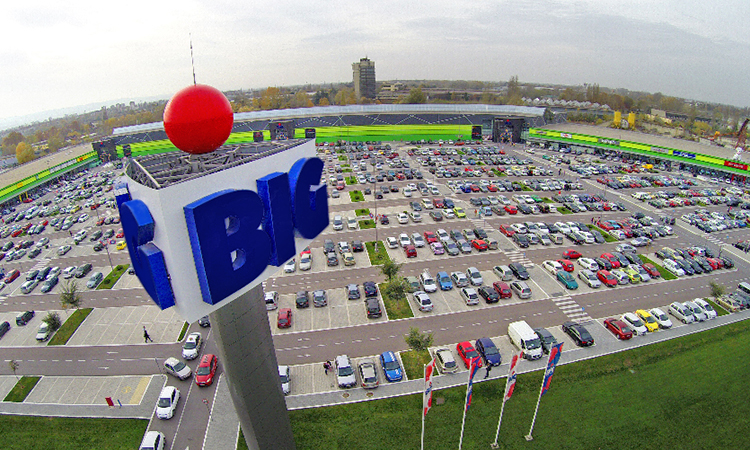
In the era of development of shopping centers in all cities of the world, thus in Serbia, we got the opportunity to establish cooperation with the shopping center BIG Novi Sad. Through ATL communication and strong digital campaigns, it was a challenge for us to contribute creative solutions to the strength and recognition of this brand with the ultimate message to a satisfied user.
SQUARE NINE
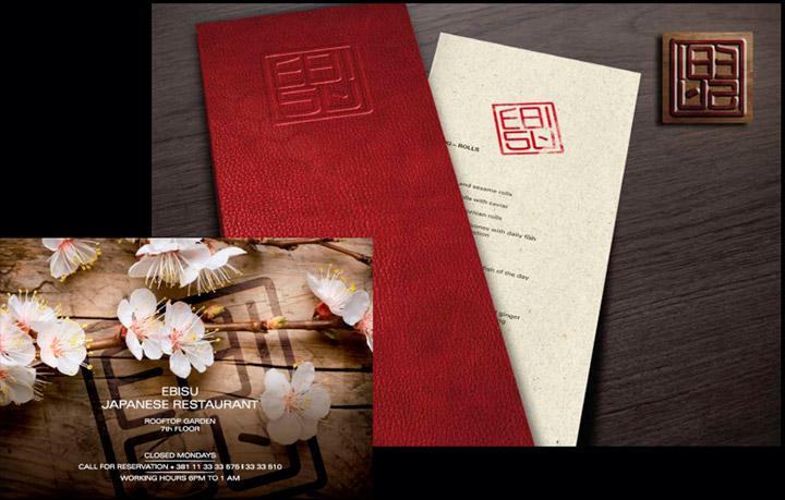
Everything about this project was related to the letter E: exotic, exclusivity, Ebisu! The Japanese restaurant located on the top of Belgrade’s hotel Square Nine needed a visual identity that adequately depicted its character. And that was the moment when we took over. We created the logotype, design of menu and all the other material for this restaurant which is one of the most exclusive restaurants in our city.
BAMBI

When a client orders a campaign from us, we deliver more than it was requested from us, i.e.: The brand Još! of our client Bambi needed a revitalisation. Of course that we did everything to modernise and refresh the communication in all the channels. But that is not all! On our suggestion, the client accepted to change the look of snacks themselves. That is how the zig-zagged snacks were created, which at the moment of launching represented a true innovation in this product category.
BAMBI

The brand of Bambi chocolate bars needed a refresh. Naturally, we gave our everything to deliver the best possible solution. Apart from the packaging redesign, complete ATL and BTL campaign, we took a step further. The special edition of chocolate bars with a SpongeBob SquarePants animation were lunched to the market. It is so nice when one can say: I love my job! And we in Orange Studio definitely can say that.
UDK TIRŠOVA

Health care is, of course, a serious question. Especially when we talk about children. But, that does not imply that one cannot attract the people’s attention and convince them to react. Our campaign for donations to the University Children’s Hospital in Tiršova Street is the real proof for that. Each and every element of this project that we realised (visual identity, ATL, digital, video testimonials) was the subject of lot of talks in the context of an effective advertising.
BAMBI

Launching the Well Be chocolates for our client Bambi is one of the examples that we proudly emphasise when we talk about a successful product launch to the market. With a slogan ”Better for me” the campaign that involved packaging design, brand identity, promotions, BTL and ATL advertising, eventually turned out to be better for everyone! For packaging design we received the Packtivity award, for the best product packaging design in Serbia (2014/2015)!
RED CROSS

Orange Studio worked hard to build the credibility of an agency known for its web development, not only for the commercial clients, but as well for the socially responsible projects, public and health care institutions. Website development and design for our client Red Cross Belgrade, is one of the things that we had done, which had contributed in building the image that we enjoy today.
BI-BAM

As part of the former movie theatre Kolosej in Shopping Center Ušće, the BI-BAM shop was opened displaying the products that had to do with the film art. Our task was to conceive a complete concept of the store, its products, visual identity… With this project, we decided to turn the things a bit upside-down. Bambi became BI-BAM, and we realised one more unusual and rare work.
BAMBI

Among the most exciting, but also most challenging things in advertising is when you work on a certain brand from the beginning, thus building its image from scratch and follow the progress. One of these projects was for the energy chocolate bars Charger. We ”Charged” it with energy and creativity and we created a campaign full of sarcastic humour, which helped this brand to take its well-deserved place on the market.
MUSEUM OF CONTEMPORARY ART BELGRADE

In places with the finest art, there is a great deal of chance that you will meet Orange Studio. The Museum of Contemporary Art in Belgrade has been carefully building its communication towards the public. One of the communication channels is also their web site. They called us for help and we created for them a completely new web site, from idea to realisation. If you are interested, please visit their web site and check how it looks in execution. Each time you wish to check the new events happening in one of the most significant museums in our country, just do it with one click!
SQUARE NINE

Square Nine, shortly after its foundation, became one of the most desirable and most wanted hotels in Belgrade. It has become more than a hotel, because it does not attract only the tourists and guests of Belgrade. Square Nine is a place of gathering, an important point in Belgrade’s social life. It is our pleasure that we gave a small contribution to the creation of this nice story, by creating their web site, conceptualising visuals and promoting their offer.
UNDP

United Nation’s Development Programme (UNDP) conducts different projects in around 170 countries, including Serbia. We are very proud of the fact that they called us to realise for them two four-year projects that raise awareness about the need to live healthy and to protect the environment. We enjoyed in realisation of the projects ”Pedibus – pupils like to walk to school” and ”Cycling through Belgrade” conscious of the fact that we are doing something useful for our environment.
SERBIAN PHILANTHROPIC FORUM

We appreciate the most those who work to the benefit of common good. We participated with great pleasure in developing the Serbian Philanthropic Forum, a platform for companies, organisations and individuals in Serbia who are dealing with investing in better society. We created for this organisation a visual identity and their web site. That is how we became part of Serbia that invests today in order for our society to become better, more just and happier in the future.
The Ministry of Ecology and Spatial Planning of the Republic of Serbia
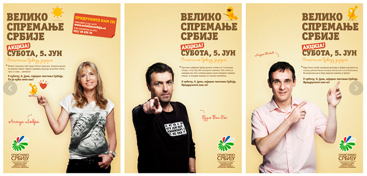
One of the campaigns that made us recognisable on the domestic communication market is a campaign that we realised for the Ministry of Ecology and Spatial Planning of the Republic of Serbia, entitled ”Let’s clean Serbia”. With the effective ATL and BTL communication, and participation of numerous public personalities, we invited the public to participate in a large action of collecting waste throughout the country. The result was a great quantity of collected waste in only one day!
MTS

MT:S is the largest mobile network operator in our country. Enough to inspire and present a challenge for every advertising agency. And when they order from you a campaign endorsed by the star Novak Đoković – things become even nicer. For this company we realised a campaign for the Sport Bel post-paid packages, where we saw Đoković in various situations. The world’s best athlete became the brand ambassador of one of the best companies in our country. And we were part of that!
FRUVITA

This is one of those examples that we talk about when it is necessary to explain what does an integrated campaign mean. In a strategically important moment for the Fruvita Company, we were invited to conceive the entire communication for the Fruvita Premium brand. Realisation of the project involved, basically, everything that occurs to one’s mind: packaging design, communication strategy and the realisation of activities in BTL, ATL channels, realisation of POSM materials and digital activations.
TELEKOM SERBIA

Working for mobile network operators in a situation when they are placing the technological innovation to the market is very delicate. You need to be careful in order to transfer the message correctly and to explain the product. But, the results does not need to be boring. Proof for that is the campaign that we realised for Telekom Srbija as part of the introduction of video call service also for the pre-paid users. The ”Now you see me, and now you do not” campaign is an example of how, if you only find the right angle, your message stays in the client’s consciousness.
BELGRADE PHILHARMONIC ORCHESTRA

How to communicate classical music to a target group that is larger than the usual one? Ask us. During the 2006/2007 season we received a task to create the season’s entire visual identity, as well as to address the younger target group than the one that used to visit the classical music concerts. The result – Belgrade Philharmonic Orchestra for the first time in history sold out the entire season. The finest artistic music arrived to the largest number of people ever. Not bad, isn’t it?
AMBIENTS
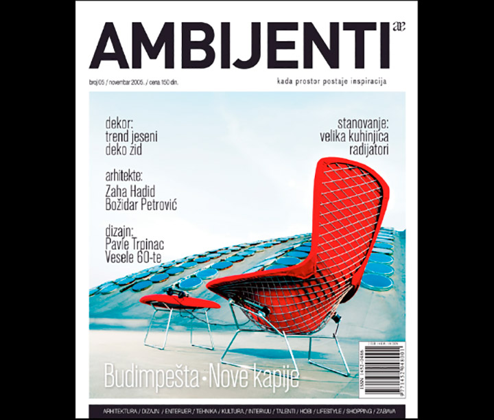
Working for each client bring certain challenges and satisfaction. But, when you work for yourself, then it brings a special feeling. Orange Studio conceived, created, designed and marketed its own magazine in the area of interior design. In that project, we joined forces with the professionals from this area and made something that was missing – a magazine to be enjoyed by the professionals from the interior design area, and all the others who are interested in the subject.
KNJAZ MILOS

It is hard even to remember all the things that we had worked over the years for the leading energy drink on our market, so let’s point out some of them: complete product design, introduction of the famous little owl as a product trademark, image of the countless special edition packagings, complete ATL and BTL communication… We are sure that everybody remember the black and white TV commercials recorded from the main character’s perspective, very much dynamically edited so that they look like full of energy.
HOT&FRESH

There are no words to describe how proud we are on the first brand that Orange Studio conceived, created and launched to the market in our own capacity. First, we created the product, then a sustainable development plan and eventually a creative strategy. We named it Hot & Fresh, because this challenge was really HOT for us, and the product something completely FRESH on the market. Who says that the advertisers cannot make candies?
RED STAR

We all know how many emotions are at stake when we talk about sport and cheering, because we had been working for years for the basketball club Red Star, on a material that involves design of shirts, calendars, season tickets and many other products. In every moment we wanted to send a message of fair play and to appeal to fans to be – THE FANS! That is how, among other things, a campaign was created, under the title: My place is on the court. And yours?
GORKI LIST

Since we were already experienced in repositioning the brand Pelinkovac and successfully placed the product to a digestifs territory, it was time to move further – to rebranding. Yes, we are responsible for creating the new name, visual identity and advertising in all channels for the product that became a synonym for quality in our region. We admit, after a hard day we also enjoy sometimes a cup of Gorki list.
O3ONE

The O3ONE project is an artistic and social platform for creating a synergy of art, science, education and technology. It is about the project that we conceived and still have been realising it for more than a decade. Thanks to O3ONE, we can already say now that generations of artists got the space to promote themselves and that the cultural offer of Belgrade is incomparably better than it would have been if this project had not existed.
Philip Morris International

When the big international cigarette producer Phillip Morris International came to our market, they insisted that the existing local brands should be taken over by the local agencies. Among the numerous projects that we realised for the brands Best and Classic, solutions from the POSM advertising category for Best stand out. Even though we know that smoking causes harm, we would not be the agency that we are if we did not test ourselves in the tobacco industry.